
goosekeeper trading co.
coffee packaging
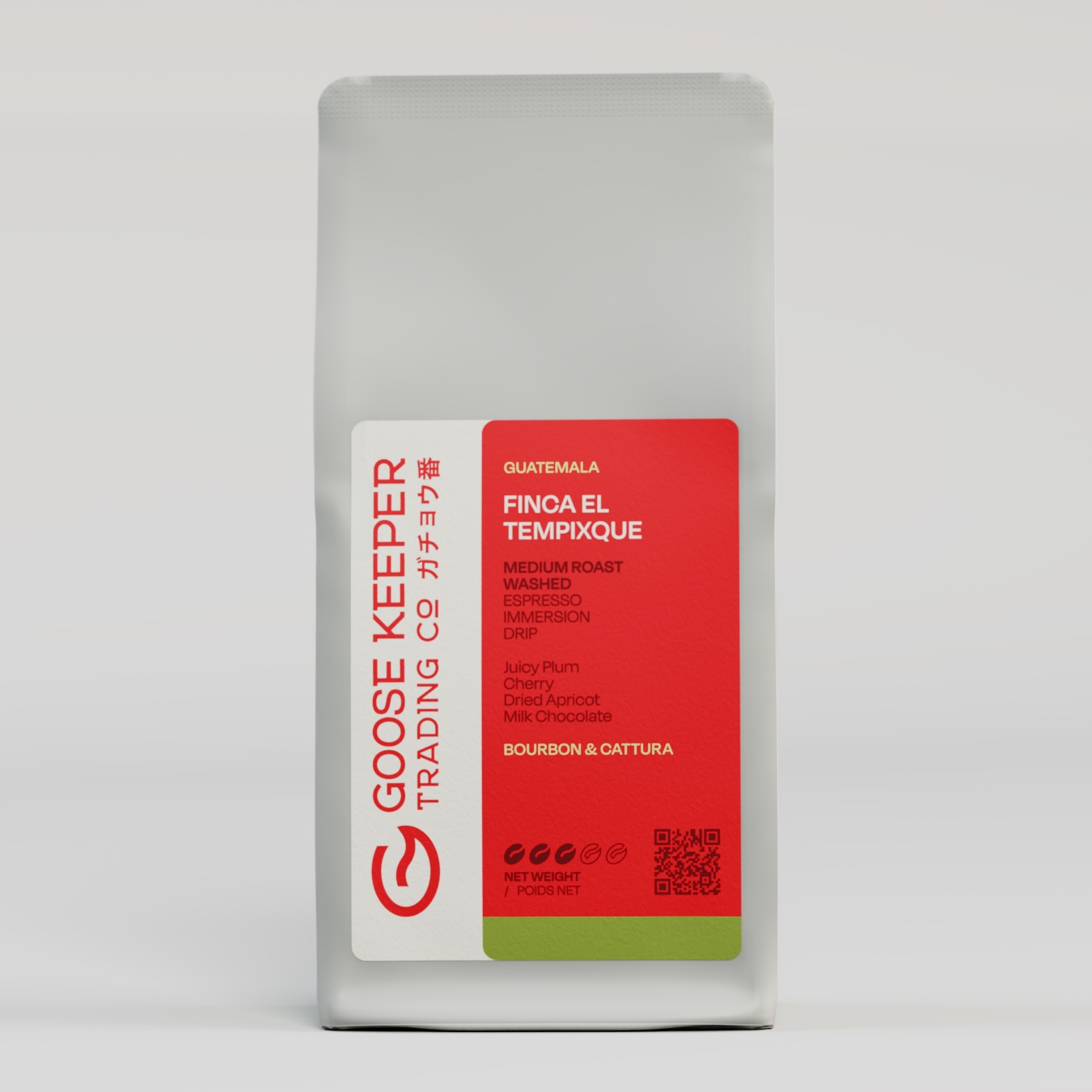
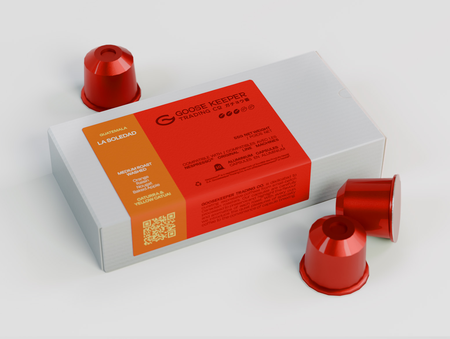
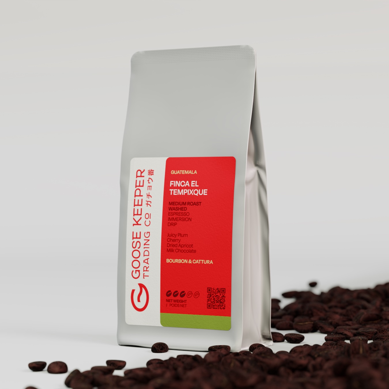
Entering the third-wave coffee scene, this Montreal packaging design unified western ideals with the founders biggest source of information, Japanese café culture. Bag and capsule options were designed with private and corporate customer bases in mind.
marketing
Following the aesthetics outlined in the packaging redesign, we reformatted the logo and designed marketing materials to be clean, orderly, and accessible to new customers.


web design
With a rapidly expanding inventory, GooseKeeper's website redesign prioritized organization and ease of user experience. We also introduced discounts and wholesale for corporate customers.
Refresh

challenge
Develop a unified product line with matching website and marketing aesthetics.
goal
Appeal to western audiences while maintaining Japanese-inspired elements. Simplify and arrange information and arrange product pages for heightened accessibility and user experience.
solution
We developed two modern and unified vessels for coffee, with convenient labels that can be printed and applied in-studio. Logos were adapted to a horizontal format, with colours and formatting mirrored across marketing images and website design.